
Tackling the brand identity balancing-act for start-ups on a mission
Lifelong was founded in 2019 in Stockholm by a self-described “team of plastic-hating, product-building, skincare-formulating entrepreneurs” on a mission to empty your house of all unnecessary single-use plastic waste.
Armed with the insight that it is nearly impossible to ship liquid products without plastic, the team challenged themselves to flip the formula, creating a dry, powdered range of products containing only 10% of the active ingredients, with consumers adding water to make the final products at home.
Lifelong’s launch range of body washes, shampoos and hand washes are delivered across Sweden and Denmark in compostable, letterbox sized envelopes, meaning their subscription service is cost-effective, whilst providing a 94% reduction in transport emissions. The cellulose pouches are compostable in 1.5-6 months, and all formulas are always; plant-based and vegan, micro- and nano-plastic free and ethically sourced.

A mission is good, a purpose is better
Bursting with category-disrupting ambition, it’s tempting to dive into the verbal and visual world of brand creation without nailing down a brand strategy. It may seem unnecessary when doing something so radically different, but there are many “disruptors” in many categories, looking and sounding increasingly alike. The risk with any brand creation is being a slave to trends, and for many start-ups, that’s the rebellious-yet-familiar, we-do-things-differently “disruptor” aesthetic and voice. To avoid this, take time to ensure you’ve landed a brand strategy that captures your unique purpose and personality.
Popp’s strategy for Lifelong is centred on the idea “connected, naturally”, an implicit acceptance that we and the planet are connected, and a belief that it can be protected while living a fulfilling, shared home life, filled with environmentally positive products.
The brand story begins, “Lifelong choices care today and protect tomorrow” a reference to not only the products, but the impact our collective decisions have on the Earth, and finishes, “Lifelong living will do you a world of good.”
It’s a subtle shift from “what” to “why” that makes the brand more relatable and the creative process to follow more fruitful.
Express it clearly, and cleverly
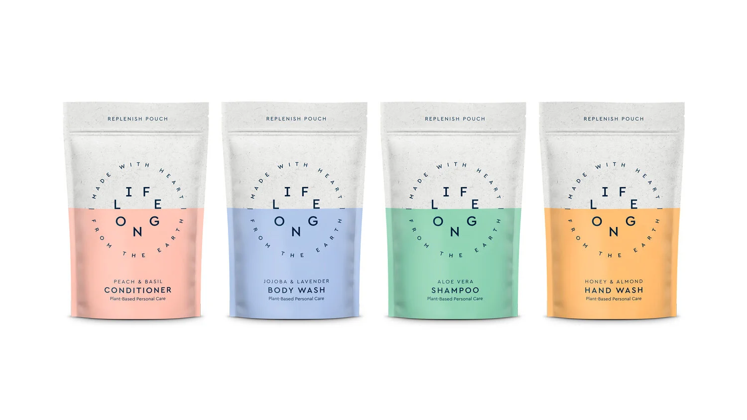
The Lifelong master logo uses sans serif typography set in the planet’s shape, with a visual trick that makes the viewer connect the word. This is paired with a simple roundel for the strapline, “Made with heart, from the Earth”, which contains the anagram HEART / EARTH, and features small dividing lines to evoke the horizon.
The horizon line itself becomes a visual asset. It is a motif in stunning pictures of nature, which serve as a reminder of the Earth’s beauty and what is at risk from pollution and climate change.
Nuance and implication are powerful features of well thought through brand assets, and being distinctive means your message and mission will stick in the minds of the consumers you’re trying to reach.
Make it easy to want (desirable), and easy to buy (shoppable)
The long-term vision is a full suite of products that integrate seamlessly into the modern home with a tasteful and timeless Scandinavian design sensibility.
In packaging, bright-yet-natural colours flood the pouches below the horizon to aid navigation. A clean typographic layout nods to that Scandinavian aesthetic at the heart of the brand.
For service-based start-ups, the same care and attention needs to be applied to user experience to make it easy (and enjoyable) to buy.
Look forward, but be pragmatic
As Eric Ries would expect, Lifelong will continue to innovate and improve their products, portfolio and packaging having created their MVP and launched their first range, but they have a strong, clearly defined brand platform to do so from, which means a clearer (and faster) path to succeeding in their mission.
Adam Webb, Lifelong Founder, says:
“Popp Studio has brilliantly expressed what our brand – and our mission – is all about. Our verbal identity cleverly highlights the benefits to the user and the planet, and the visual identity is distinctive and engaging, setting us apart from our competitors.”
Poppy Stedman, Popp Studio Creative Director and Co-Founder says:
“As a young business with the ambition to grow and make a genuinely positive impact on the environment, we sought to give Lifelong an identity that expresses not only their today but also their tomorrow. The verbal and visual identity systems, and clean, punchy packaging designs get the Lifelong message across and are easy to expand as the brand grows.”
Looking to tackle the big boys and disrupt the world for good?
Do it right, and do it once to set your brand up for success. Book a call to speak to us about our three-step “Distil, Create, Deliver” method.
View the full Lifelong case study here.