Popp Studio sparks quiet revolution with brand creation for Rebel Blends
Popp Studio has created the brand strategy, visual identity and packaging for London-based, start-up eco-luxury body care brand, Rebel Blends.

Rebel Blends’ first range of skin-repairing body oils was conceived to solve a personal problem no conventional products were capable of doing. The idea soon developed into a passionate protest against the poor practices of the conventional beauty industry, manifesting as a vision of “radical transparency”.
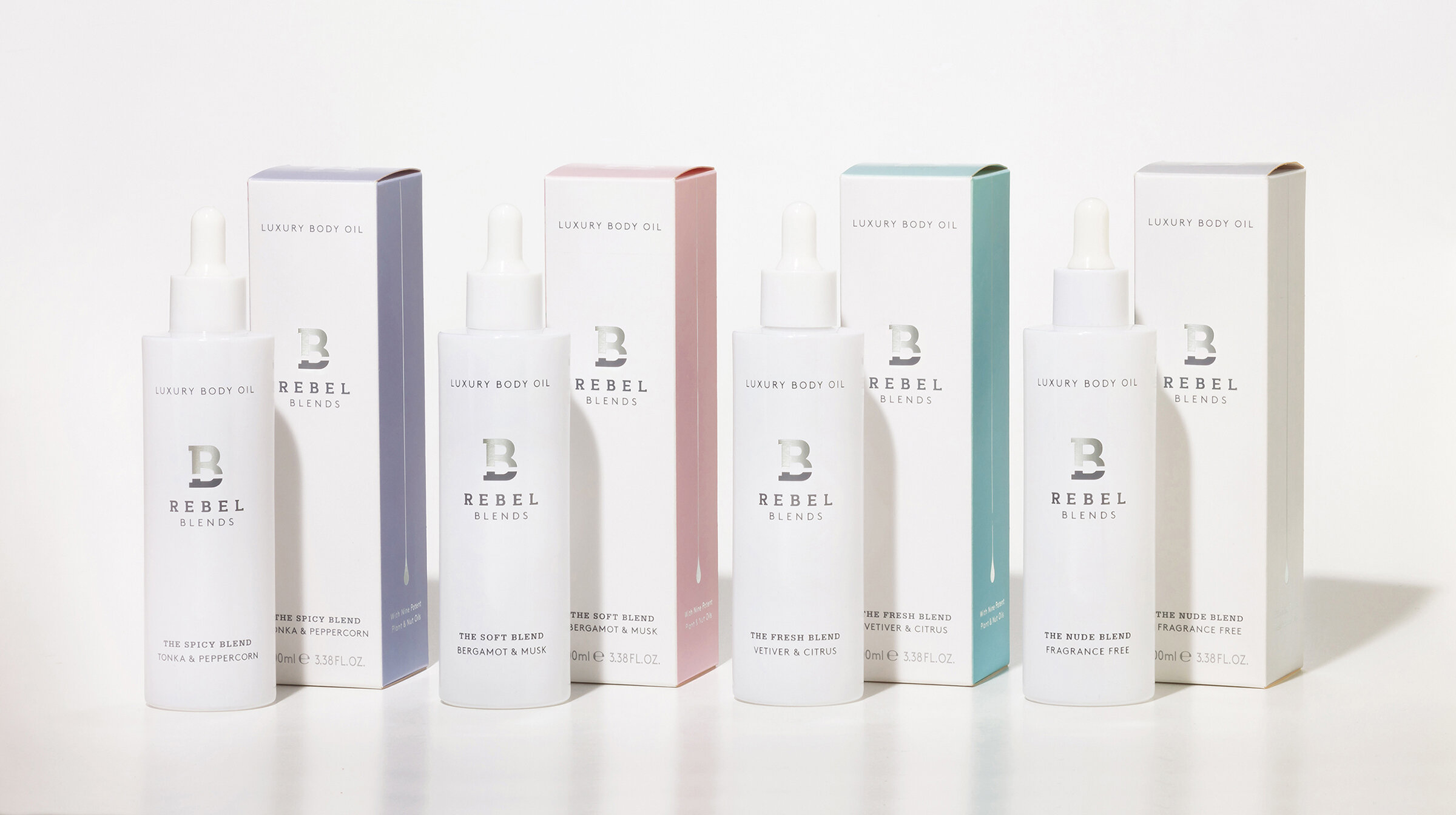
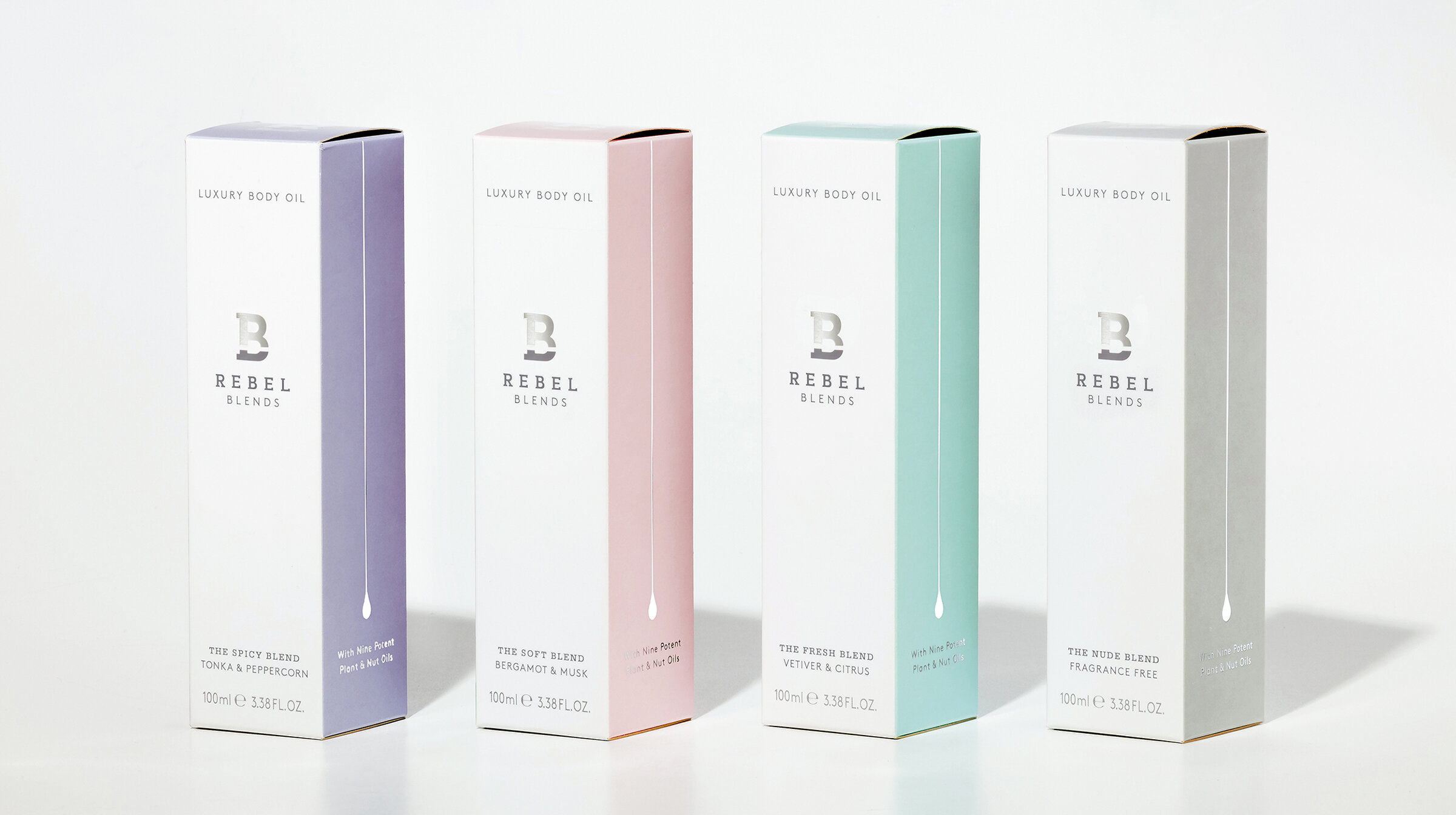
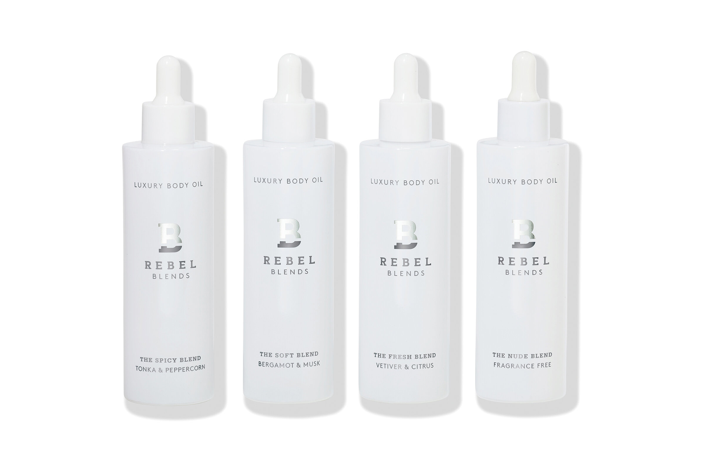
The launch range comprises four blends: Nude, Fresh, Spicy, and Soft. Each is blended using nine different essential oils – far more than most other products available – and are as close to the natural source as possible, being 100% vegan, cruelty free, non-toxic, and packaged with fully recyclable materials.
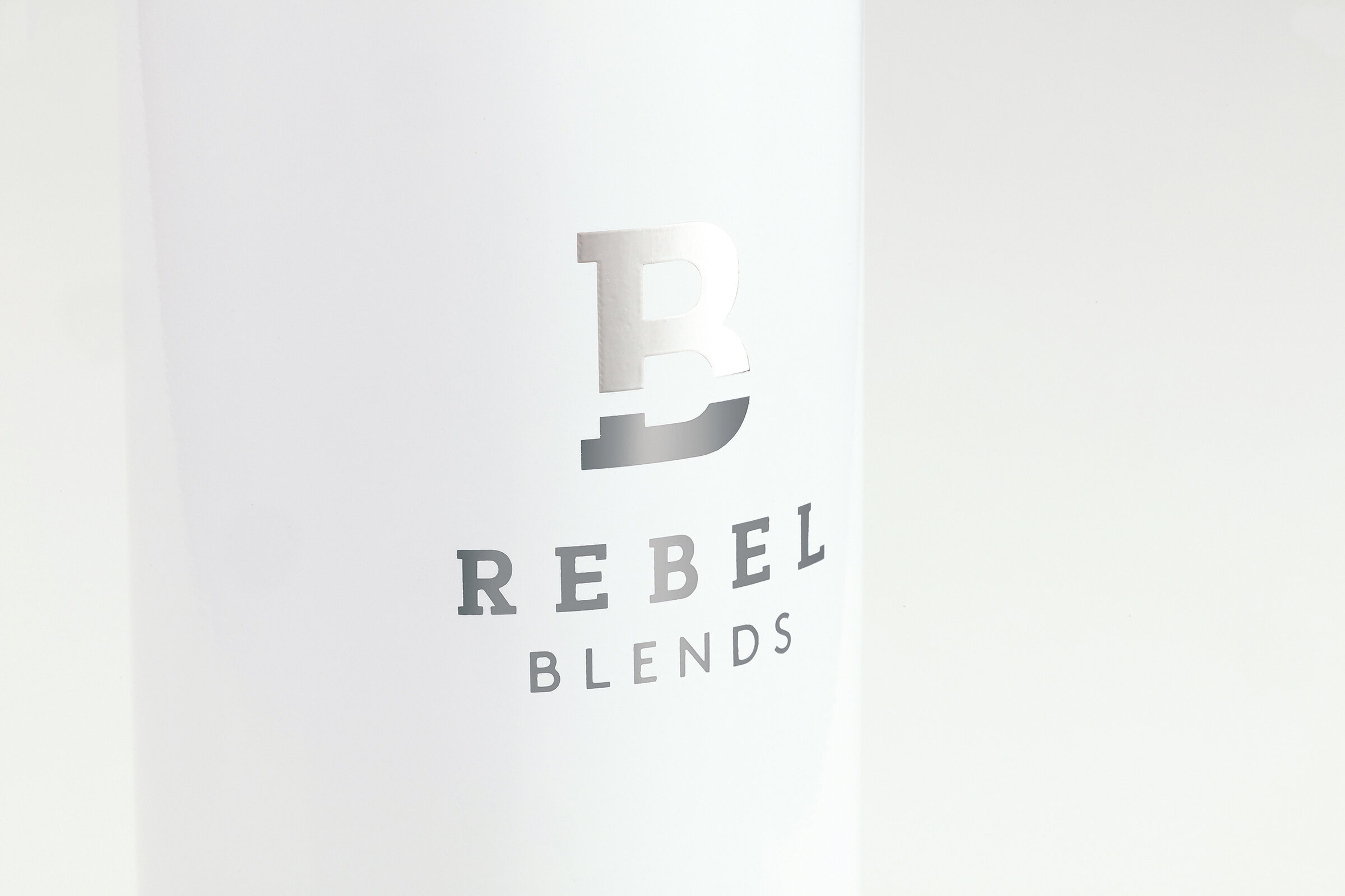
Popp Studio’s strategy was anchored in the idea of “bold renewal”, reflecting the strong ethical standards of the business and incredible benefits the products bring to their users. The logo at the heart of the visual identity combines an ‘R’ and a ‘B’ in a stencil-graphic style, using the visual language of protest to communicate Rebel Blends’ rebellious nature.
The drop on the side of the packaging symbolises the quality of every blend through its consistent line weight, and the number of different oils used through its length.
Both the logo and drop can be used flexibly, taking on different colours, but on packaging they appear as stunning silver foils on white or soft variant colours.
Finally, colourful paint-blends, handmade by Popp Studio, bring to life the otherwise invisible blending process in a visually stunning way with carefully selected complementary and contrasting colours that blend with, and rebel against, each other. The paint-blends can be cropped in different ways to create impact on packaging and other touchpoints.
The colour palette combines a premium, timeless mix of white and dark grey with carefully selected variant colours that evoke the scent and character of each blend.
Poppy Stedman, Creative Director and co-founder of Popp Studio, says:
“The paint-blends symbolise everything that is great about Rebel Blends: blending and rebelling at once, combining a strong ethical stance with a truly nourishing, indulgent product. The identity is a simple and strong marque that will become synonymous with the radical transparency that Rebel Blends stands for.”
Adriana Harseva, Rebel Blends founder says:
“Popp Studio has been an invaluable partner throughout the creation of Rebel Blends. They immediately understood what we were trying to achieve and the execution was better than we ever imagined it could be. We have such a strong foundation for the brand, and the visual identity and packaging have the impact we need to drive growth.”
Andrew Slade, Managing Director and co-founder of Popp Studio, says:
“Adriana was a really inspiring partner to work with, and her commitment to the very high standards she sets, and in seeing the design vision brought to life so fully, is a sure sign of great things to come.
We can’t wait to see Rebel Blends’ quiet revolution take hold in the world of skincare.” Rebel Blends is available online now at www.rebelblends.co.