
Popp Studio rebrands digital product agency UVD as We Make Waves
Popp Studio has created a distinctive, digital-first brand strategy, visual identity system and guidelines for Shoreditch digital product studio We Make Waves.
In 2018 digital product agency UVD set out to embrace change in the technology industry, and reshape its offer to better meet the increasing demand for genuine strategic expertise in developing product and using sound judgement to increase the chances of success.
With strategic guidance from Popp Studio, UVD summed up their new proposition and philosophy in a name that is a collaborative, yet confident, statement of intent: We Make Waves.
Popp Studio then defined the brand purpose and values for We Makes Waves, with the idea, Ripple Effect, at its heart. The idea encapsulates the results the business delivers to its clients and their businesses, through the power of many smaller, calculated risks building to make a bigger impact.
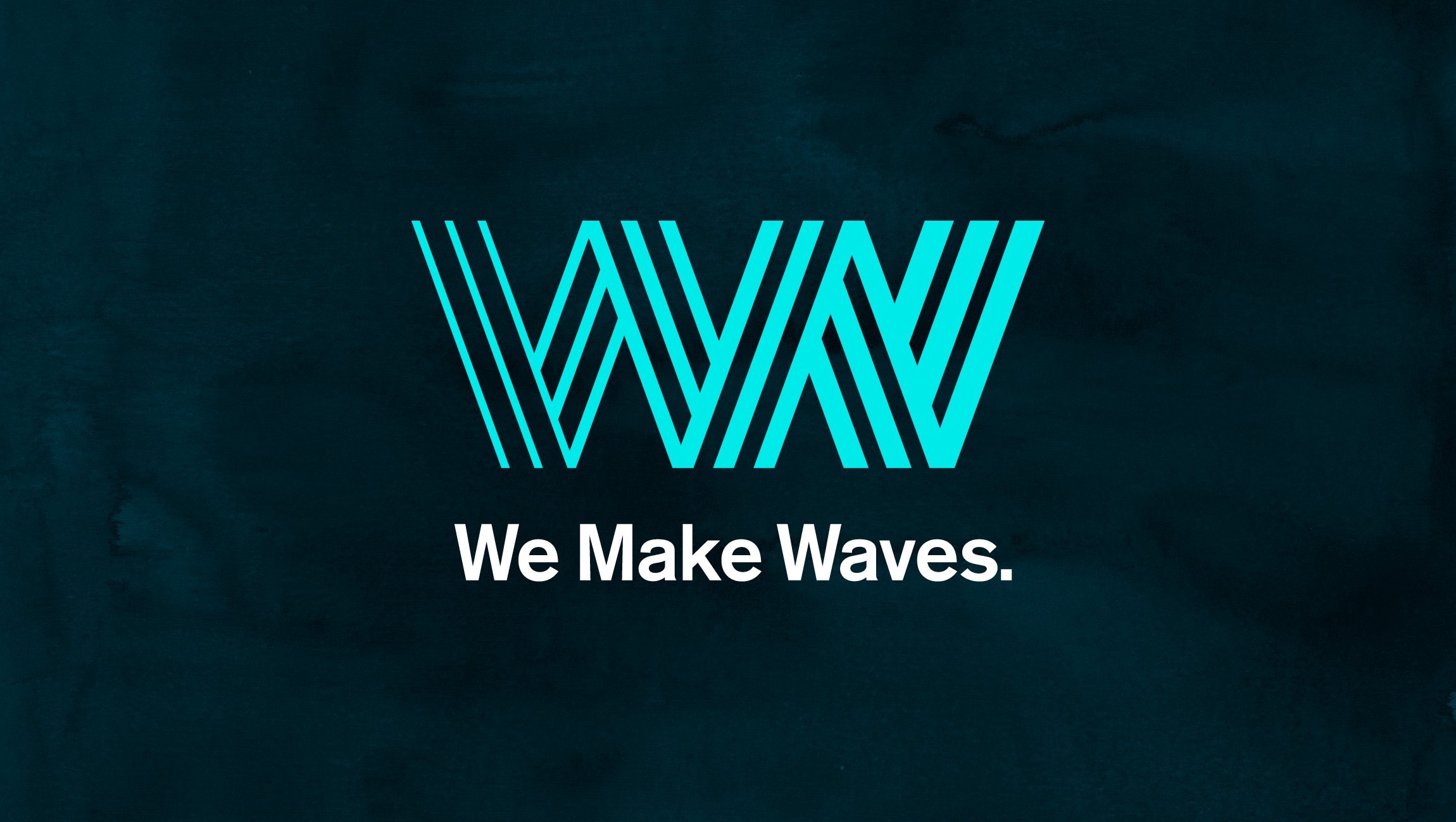
The icon at the heart of the visual identity, the Ripple Wave, combines the letters W, M & W to suggest collaboration in a mark that ripples from left to right. Each section is made up of three stripes, reflecting the three-stage approach.
The master lock-up combines three distinctive assets: the Ripple Wave icon in electric blue, the wordmark, and the Deep Sea background.
The wordmark is set in a bold, title-case, tightly kerned for extra punch, and is signed off with an emphatic full stop.
These assets combine with the handmade, textured ink of the Deep Sea background to create extra depth and a crafted, human touch, which contrasts the sharp, clean lines of the Ripple Wave and wordmark.
This master lock-up is supported by secondary assets, including The Swell, which is drawn from the tips of the Ripple Wave to resemble a view from the shore, watching waves crash in.
It helps create pace, overlapping with other elements, or can be used to guide users through information or to highlight important text. Crops of The Swell also combine with a simple, linear drawing technique to create a distinctive We Make Waves illustration style.
All typography is clean and precise, and balanced with a dash of personality from a script that feels hands-on and collaborative, reflecting the human touch and expereince that is needed to deliver great strategic advice.
The vibrant and fresh primary colour palette is a dynamic take on the hues of the ocean, while the secondary colours exist to bring variety and playfulness to the visual identity.
Kirsten Minshall, CEO and We Make Waves founder says:
“When we looked for a company to help us with a complete brand overhaul, Popp Studio really impressed us with their creative experience and enthusiasm – we clicked. Popp led us carefully through the strategic and creative process, always on hand to help us make the important decisions, and they have produced a brand that is beyond our expectations.”
Poppy Stedman, Creative Director and co-founder of Popp Studio, says:
“We were really excited by the name conceived of by Kirsten and his team following our initial meetings, and eagerly set about bringing it to life in a way that expressed their curious, enthusiatic, honest and collaborative approach. In balancing the aesthetics of the world of technology with the human side of the consultancy model, and their collective experience, we’ve created an identity that will equip them to tell their story in unique and engaging ways for years to come.”
View the full case study here.